I spent several sleepless nights having nightmares about the dropdowns in the product my scrum team and I have worked on, called Best Fit. This is the story of how I, IMO & backed up by data, made the best experience for our users out of a flow consisting of seemingly endless dropdowns.
✨ The Product — Best Fit
In a nutshell: Best Fit gathers information from users about their academic background and financial possibilities, then compares that to the data StudyPortals has on the specific programme a student is viewing. Cross-referencing all the information and using a complex algorithm, Best Fit presents students with a result in terms of how well they fit the programme.
*Disclaimer: the screenshots I will be using to show the improvements I brought to Best Fit are from the current live version, including a fresh coat of visual paint created by Fay Theo.
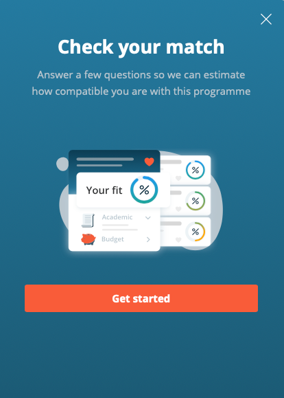
The opening page of Best Fit
💪 The Challenge
Best Fit consists of multiple questions on separate pages, which the user goes through one by one. Naturally, you lose some users along the way; however, the drop-off and final completion rates were unnaturally low. The clickthrough rate from page to page varied between 65–85%. So the main task at hand was to optimise the drop-off rate across the flow and subsequently the completion rate.
When dissecting the problem, it became rapidly apparent that the drop-off source was the favoured interaction method; dropdowns. To start, my scrum team and I ran extensive testing on multiple devices to find reproducible bugs. While we found and fixed several critical bugs that stood in the way of usability, we had to realise that there was more to it than we initially thought.
At this moment in time, Best Fits dropdowns were barebones. A list of items, which are scrollable and tapping “H” on the keyboard, would jump to the first item that starts with the letter “H” in the list. That was it.
Being the great tool Best Fit is, it has to cater to all students and universities. Meaning, hundreds of countries to pick from, all universities and colleges in each country, a boatload of disciplines, all the available currencies in the world (including gold & bitcoin) and a handful of grading systems.
If you would add up all the items you had to scroll through, you were in the hundreds. No wonder users were dropping off left and right.
🔎 Type-to-Search
After thinking through the issues and having a list of ideas, we realised that type-to-search within the dropdown list was the most valuable improvement to introduce. It would drastically improve users’ experience when looking for a specific item in the dropdown, and the implementation wasn’t more than a sprint.
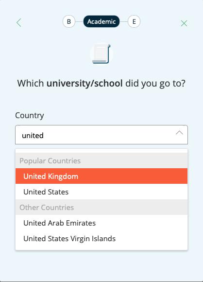
Type to search meant basically a filter and sorting functionality at the same time. When you start typing “u”, any countries not including the letter are straight away omitted from the dropdown. Next, countries beginning with the letter “u” would present themselves at the top in alphabetical order. Lastly, countries that included the letter “u” anywhere in their names would appear in alphabetical order afterwards. Meaning that, within the list, the United Kingdom or the United States would appear on top, followed by results such as Austria or Hungary. As you typed your search, the results got more refined, excluding additional items from the complete dropdown list.
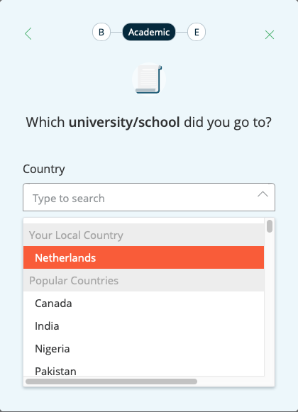
Type to search
An example of searching within a dropdown with hundreds of options
🤓 Context Awareness
First off, it was crucial when having access to users’ cookies that we utilise the available information to help make their experience better. So what information did we have available?
1. IP address, which of course, gave us a hint at their location
2. Nationality which users could fill in in their account details
3. The information they provided us in various steps of the flow of Best Fit
How did this look in practicality? We added at the top of the dropdown list a segment based on user data. For example, when we knew the user was browsing from the Netherlands, we suggested the local currency from where they browsed. In this case, euros.
With studying abroad, naturally, your current location may not be your nationality. Given a scenario where a user is originally from the US but is studying in the UK, we would suggest GBP as their currency rather than USD. So if the user has already filled in their nationality — we would default to recommend the currency of the nationality.
Currency Suggestion | Based on local IP or nationality provided by the user
The last point we noticed didn’t have an enormous impact on drop-off rates. However, I theorised that with long user flows such as these, delighting the user by saving them a bit of effort would increase their trust and appreciation for the brand. So, let’s say a user selects that they have studied in the United Kingdom and found their university. Rather than having them search through the dropdown we suggest all the relevant grading systems of the country. Which, in the case of the UK, isn’t just one.
A hint of user delight
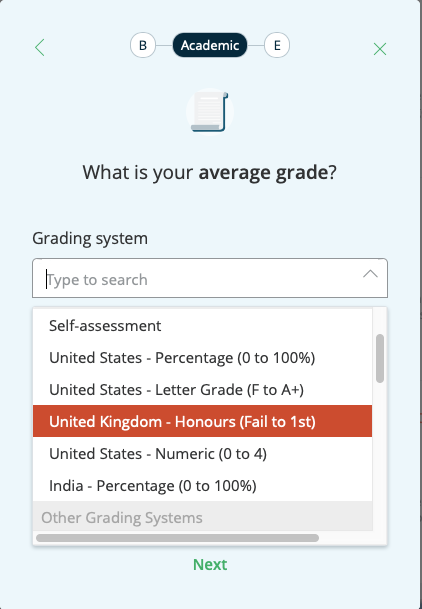
Using university location to inform smart suggestions in a follow-up question
Of course, these three methods were combined, which resulted in a complex logical behaviour for the dropdown. This required mapping out the behaviour in a flow chart for developers and me to be aligned.
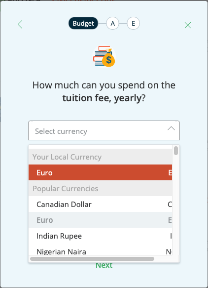
📊 Data-Informed
Being a company that strives to be data-informed, giving the most popular options as a suggestion was also a logical step. Depending on the dropdown, we could help 60–80% of users find what they are looking for by bringing them above the fold as suggestions. For such behaviour, I decided to suggest the top 5–10 selected items in a dropdown.
We found it crucial to distinguish between the “smart suggestion” and the “popular suggestions” in all dropdowns. For this, I reused the same design pattern across all dropdowns within the tool and advocated to bring this language to the rest of the dropdowns we had on the platform for consistency’s sake.
The below screenshot illustrates the main improvements made to the dropdown without the use of the type-to-search functionality. Under “Your Local Currency”, users see the currency of their location or nationality, followed by “Popular Currencies” which are the top 10 most selected currencies in Best Fit.

Data informed suggestions | Bringing the 10 most popular currencies in the tool above the fold
🤯 The Results
As I’m writing this two years after the work has been carried out, I, unfortunately, don’t have exact numbers on the improvement. From memory, I can recollect improving the completion rate going from between 65–85% to bringing all pages to above 90% completion rate.
I do recall that not only did the combined completion rate of the two tests increase, but the registration rate did drastically as well. So much so that we managed to outperform our set yearly team goal drastically. This team goal comprised of a calculation made up of users completing the flow 100% and registering at the end.
Therefore I can say that this project had a significant impact.
👨🏫 What I learned
• Look beyond your product
If you provide a service; utilising information across all of your touchpoints can improve the overall experience of your users. This will, most of the time, translate into improvements to your final KPIs.
• Work it out to its tiniest details
From functionality, order of lists, to all the different states and how they work together with the information architecture of the dropdown list, all of which should be well designed.
• Test it out on all devices and browsers
Custom dropdowns can be tricky for developers, as they come with a multitude of bugs. Make sure they always work as intended.
Lastly, ask yourself:
“Does this really need to be a dropdown?”
Sometimes a dropdown just doesn’t make sense. If you can eliminate the use of it, you should. Look for alternative interaction methods and components.
Overall, this entire exercise was exceedingly interesting and fun. I experienced how much small optimisations can lead to a big impact and how exciting bringing usability enhancements to dropdowns can actually be. If you must use dropdowns, I definitely recommend doing this for your products!
__________________________________________________
A big inspiration to the work and the approach came from the incredibly entertaining SXSW keynote presentation titled “You know what? F***k Dropdowns”.